8 Apr 2013

Magazine Cover Project Evaluation


What was the theme for the project?
The theme of the project was to create the front cover of a magazine of a topic of our choice. I chose high fashion as it really interests me and I have seen and read many magazines of this genre. I also already had ideas for a high fashion cover and magazine name. 
How have you developed your ideas? How did your work change through the project?
Initially, I planned for my cover to be more of a basic, minimalist design with very little type. However, I decided to use more text to make the cover look less sparse. I originally used a secondhand image from the internet and made the type off-white/grey and a light, dusty pink to match it, but when I changed the image to my own photo, I changed the colours of the type to match that photo. 
How many photographs did you take? Do you think you should have done more or less?
I took about twelve photos in total, which was a substantial amount. Although, they were all extremely similar and I feel that I could have taken more, experimenting with different settings, poses and styles.
What artists or designers have you looked at to help and inspire you?
I looked at many different magazine covers of the same/similar genre as mine, such as i-D, Dazed & Confused, and POP. I also visited the Vogue website, to find inspiration for my cover lines and find out fashion news etc.
What materials, tools and techniques did these artists use? Think about lighting and wardrobe.
All of the magazine covers I looked at were very minimalistic and simple. They all used quite unvaried colour schemes and plain backgrounds. The images were the main focus, as they were very bold and close up to the models faces. They were concentrated less on  their clothes and more on their faces, makeup, hair and expressions/emotions.
How have your skills developed during the project? Photography and Photoshop
At the start of the project I still felt quite new to Photoshop, however the further I went with creating my magazine cover, the more I learnt. I learned about editing images, adding shapes and changing the opacity of them. I also learned a lot about photography, lighting and the styles used on different types of magazine covers.
Are there any aspects of your studies that you wish you had explored further?
As mentioned earlier, I do wish that I had explored the photography side of the project earlier in order to develop my skills more. 
How have you used formal elements such as line, tone, colour and shape?
On my magazine cover I used a circle shape to add some different elements to the cover, and create a 'sticker' effect. In terms of colour, I used colours that I felt went well together, but also contrasted, and matched the colours of the image. 
What materials did you use, and why? Did they work successfully?
I used Photoshop to create my magazine cover and a basic digital camera to take my photos. I think these materials worked well - using Photoshop gave me the ability to edit my images and cover in-depth and really make the cover look professional. I didn't use any hand drawn type because I wanted my cover to look stylish, professional and less 'handmade'. 
What meaning and messages did you want to convey and were you successful?
The meaning of my magazine was to inform people of fashion news and new trends. On my cover I attempted to draw in people who would be interested in high fashion and would want to learn about it, and I think I successful in doing so
Are you happy with your final piece? Are there any elements you like in particular?
Is there anything you would change? Why?
I am very happy with my final piece and I feel that it turned out exactly how I wanted it to. I would possibly change some of the typefaces as they are very similar, or change the masthead's typeface to differentiate it from the rest of the cover. I would also change to green type to a different colour, as it may be difficult to read from far away. Overall, I really like my magazine cover and I don't feel that there are any large problems with it or big things that need to be changed.

Portrait - Megan Fox


A portrait of Megan Fox. We were told to make it look more like a painting than realistic, by not smoothing out the edges and showing paintbrush marks etc.

Still Life - Lemons


A still life of two lemons, which I painted using only the colours yellow, purple and white.

Sketchbook Pages

'Exploring Your Pigments'
' Pigment Placement'
'Paint Colour Swatches'
'Investigating a Palette'

Annotated Magazine Cover


This is my finished magazine cover, annotated by Becky and Emily.

5 Feb 2013

Pencil Draft


This is the draft of my 'BOLD' magazine cover, which I drew in pencil before moving onto my Photoshop cover design.

Similar Magazines

These are four magazines which I feel are similar to my own, and helped give me inspiration for my magazine cover. They are 'Dazed & Confused', 'i-D', 'Love' and 'Pop'.

Magazine Cover - Work In Progress


This is my magazine cover at all the different stages of creating it.

31 Jan 2013

Magazine Cover Images - Contact Sheet


This is a contact sheet of the twelve images I took for my magazine cover. I chose the second one as it has the best lighting and composition, whereas in the other photos the lighting is too dark, too bright, or my face is not in the middle of the image.

Final Magazine Cover


This my 'BOLD' magazine cover, completely finished.

9 Jan 2013

Magazine Analysis


This is the 'NME' magazine cover which I analysed, in order to help me learn the conventions of a magazine cover.

11 Dec 2012

Poem Book Cover Final Piece


Book Cover Project Evaluation


What was the theme for the project?
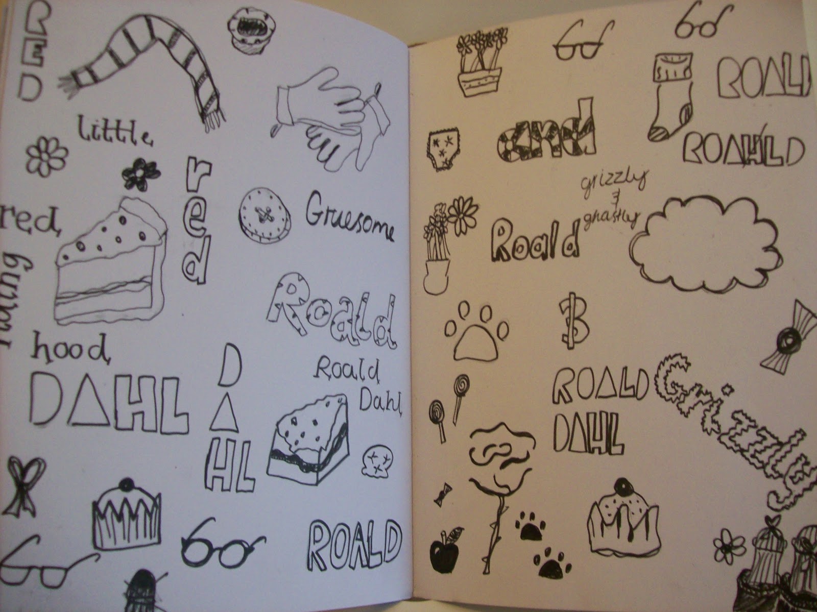
The theme of the project was Roald Dahl's poem book, 'Grizzly and Ghastly', which was based off Little Red Riding Hood, but it had a twist. We had to design a book cover for it. 
How have you developed your ideas? How did your work change through the project?
Originally my design ideas were very different to the final cover I have finished with. One was the wolf looking out of the window at Red Riding Hood. Another of my ideas was an image of Red Riding Hood and the wolf standing face to face. My ideas developed and I decided to completely change my cover plan. I decided on an image of the granny standing in front of her house. My ideas about the fonts I wanted to use and how I laid out my cover also changed through the project. The hand-drawn and digital fonts that I used were completely different to the ones I was originally going to use, but I think they look a lot better. I think my final piece is a lot better and more effective than my original idea.
How much reference material did you find? Do you think you should have done more or less?
Along with the reference material that I was given, I also used a few sheets of my own. I used images of wolves, grannies, red riding hoods, paws and paw prints, and the original 'Roald Dahl's Revolting Rhymes' book as inspiration. They all helped with my ideas a lot, especially the images from Roald Dahl's book. There were pictures of Red Riding Hood with a gun, wearing a fur coat, and pictures of the wolf. These images especially helped as they were all related to the poem, and also gave me an idea of the type of images Roald Dahl liked to have in his book, and on his cover. However, I do think it may have helped to have some more reference sheets to use.                                                                                
What artists or designers have you looked at to help and inspire you?
I have looked at the artist Scott Campbell, who painted pictures of wolves and creatures wearing clothes and standing on two legs like humans, to help give me inspiration and ideas. I really liked Scott Campbell's paintings and the techniques that he used. These images really helped give me inspiration and I also liked recreating his paintings myself.
What materials, tools and techniques did these artists use?
Scott Campbell used black gouache paint for his designs. This is similar to water colour and I really like the technique.
How have your skills developed during the project?
Before the project I didn't know anything about photoshop, or how to use it, let alone things like keyboard shortcuts. I also didn't know much about different artistic techniques, or even how to use a scanner. I think my skills have developed a lot through they course of the project, I have learnt a lot, and also now know more about using Blogger. 
Are there any aspects of your studies that you wish you had explored further?
I wish that I had explored the gouche paint technique further. I really liked this style of painting and it gave a  slightly messy effect which I liked. I also wish that I had explored using hand-drawn type more.
How have you used formal elements such as line, tone, colour and shape?
I have used different lines and shapes as well as colour. I think I should of used more tone on my final piece, to give more variety.
What materials did you use, and why? Did they work successfully?
I used pencil and fineliner, I enjoyed using these materials and I think they worked quite successfully.  If I could change my cover I would use some different materials such as gouache or ink, which would stand out more, and be more effective.
What meaning and messages did you want to convey and were you successful?
I wanted to convey the basic plot of the poem, Red Riding Hood visiting her grandma's house, without giving away too much of the plot. I still wanted to hint the 'evil twist', which I did with my hand-drawn title font. I think I was successful. 
Are you happy with your final piece? Are there any elements you like in particular?
I am very happy with my final piece and in particular I like the different fonts that I used.
Is there anything you would change? Why?
I think that I would change the leading of the text on my front cover. I would also maybe add some different techniques such as gouache paint or ink, to give more of a variety on my final piece. I would also use more colour on the front, so the book cover stands out more, and maybe rotate some of the text to give more of a variety of angles.